Experiencing The Elizabeth Line, November 2022

London’s newest addition to its mass transit network is a bit of a departure, but not an unexpected one. This needed expansion, cutting cross-city travel times drastically, gives me the feeling that London needed something to restore some civic pride in a way. Grand infrastructure projects, like the repurposing of the iconic Battersea Power Station or the new (mostly hidden) Thames Tideway are needed even if they do come in massively over budget as well as late.

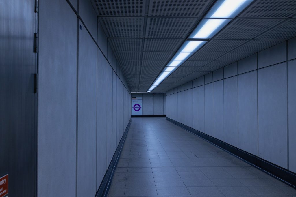
I wanted to have a look at the architecture and see what it was like to travel the line off-peak. Taking the Northern Line from Waterloo, I joined at Tottenham Court Road. The first thing that struck me was how incongruous the access to the new section of the station is. You go down a few corridors, turning left and right as you’d expect then up half a dozen steps and across a fire door threshold onto the new platform. The change from the “old” ceramic tiles to the new concrete panelling is abrupt, perhaps intentionally so. I was expecting a bit more fanfare, having seen the pictures of the new entrance built for the line.

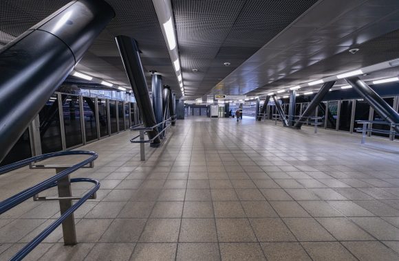
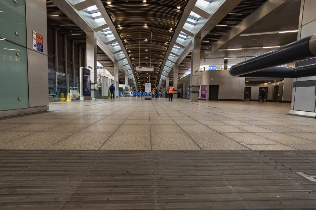
The first thing that hit me was the scale of the place. It was unexpected. It is enormous in comparison to the rest of the station.

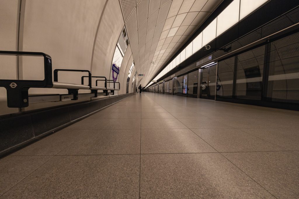
In planning the trip, I’d looked at the sketch plans published as part of the tendering process which had the platforms shown as 200m+ long and the rest of the line is built to that scale. This is a space that is designed to move a lot of people through it as fast as possible. The other thing that struck me is that it feels like a much safer space than the older parts of the station. There are no nooks, crannies or alcoves, everyone is out in the open. The concrete panelling deadens the ambient sounds so there are only diminished echoes of footsteps, conversations and machinery – most importantly the trains. The platform shielding also blocks the rushes of wind as the trains come and go but there is sometimes an eerie whistling as it squeezes through the gaps.

Like the M52 line in Amsterdam, this is what modern mass transit should feel like. Safe, effective, and efficient.

That said, it all feels a bit… “well-mannered”. Beyond its scale and a vague sense of ambition, there’s nothing imposing about it. It is almost Georgian in its sense of apology, desperate to offend no one, it is vaguely offensive itself. If you compare it to the muscular authority of the station design on the Jubilee line, it almost leaps out at you – Westminster for example, shown below.

Westminster Underground
Some of the workings of one of London’s subway system stations laid bare

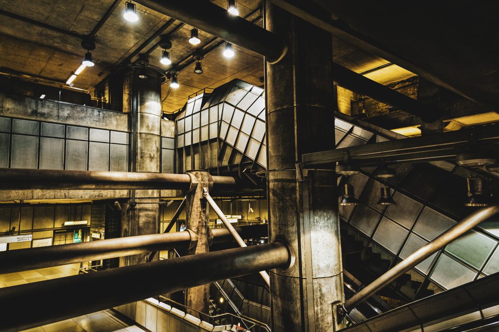
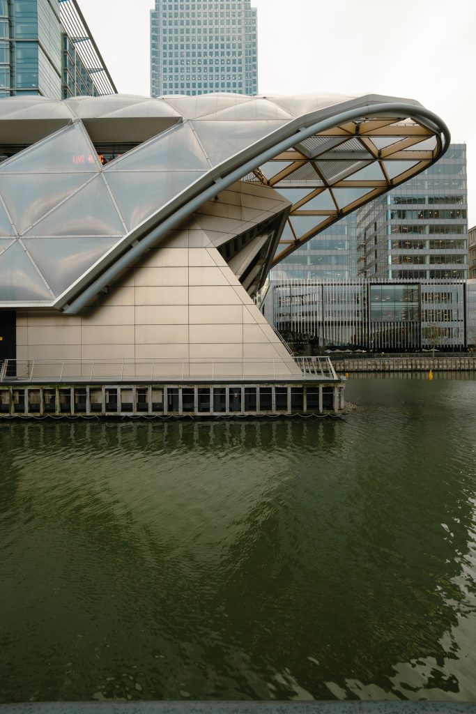
My first destination was Canary Wharf, the idea of the old cut and cover tunnelling method being adapted for use in the East End’s North Dock intrigued me. Another enormous platform greets you and you move up through a four-story box to the ticket hall. It’s so big.

A longditudinal view of the largely empty Elizabeth Line ticket hall at Canary Wharf statsion
The scale of this place was almost shocking.

But, once you get outside, the station seems dwarfed by the buildings around it. The cut-and-cover idea turns out to have been a mistake on my part, they just dug a hole and there I was hoping that they might have had the courage to have the escalators and lifts running through the water instead of an as-yet unopened shopping mall above the platforms. But no, commercial necessity trumped aestheticism as usual. The part I liked most? The roof garden is a sheltered, accessible, quiet and welcoming space concealed by a pleasing roof.

Looking up to the roof panels concealing the plant rooms and roof gardens at Canary Wharf's Elizabeth Line station
Looking up to the roof panels concealing the plant rooms and roof gardens at Canary Wharf’s Elizabeth Line station

The ends of the station impart a sense of movement in contrast with the buildings which project an image of solidarity appropriate to the seriousness of the business conducted here.

The Eastern end of the Elizabeth Line's Canary Wharf station viewed in profile. It resembles the prow of a large ship.
Hinting at the maritime history of the area, the resemblance to the prow of a chip is a nice touch

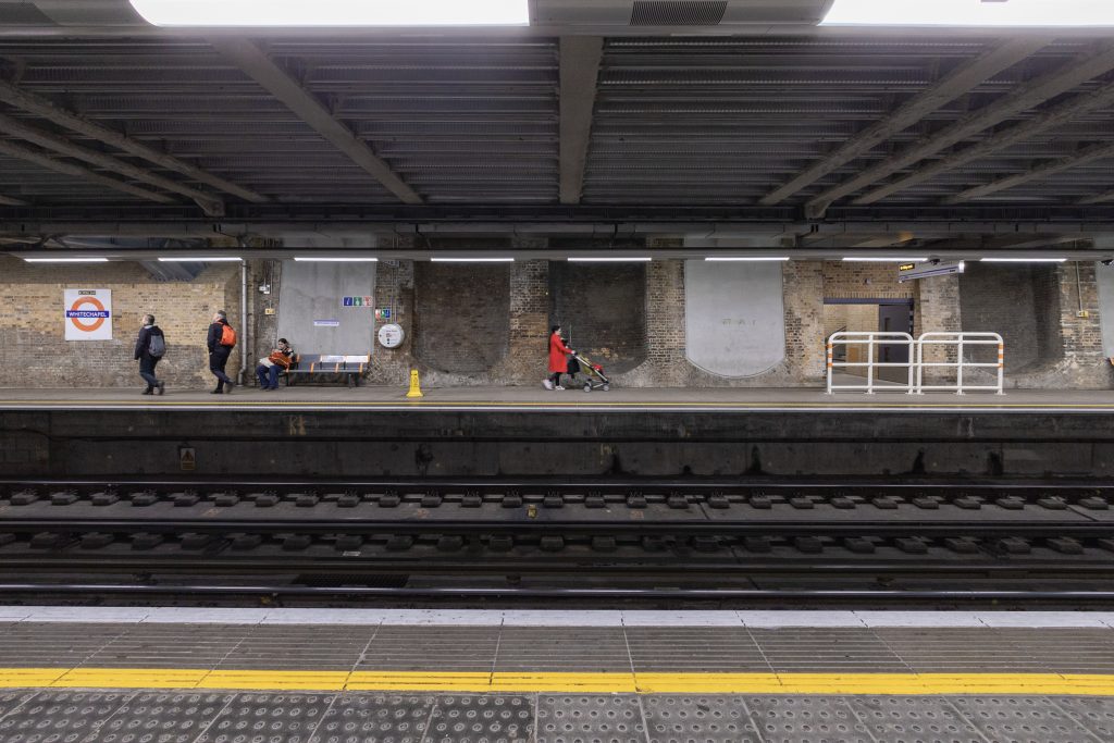
These trains move fast and the stations are well spread out compared to the underground so there can be a strange hum as they cruise between stations. Back into the tunnels for my next stop, Whitechapel. The schematic piqued my interest because of the extensive remodelling required to incorporate access to the new line as well as the other two. Someone came up with the idea of going up rather than more excavations. So, we got a “flyover”.

The ticket hall at Whitechapel Station showing the curved roof echoing the "overpass" redesign of the old station
The ticket hall at Whitechapel Station showing the curved roof echoing the “overpass” redesign of the old station

Supported by this:

A walkway, part of the supporting infrastructure at Whitechapel Station showing muscular steel work.
Exposed steelwork hinting at the enormous weight of the superstructure above

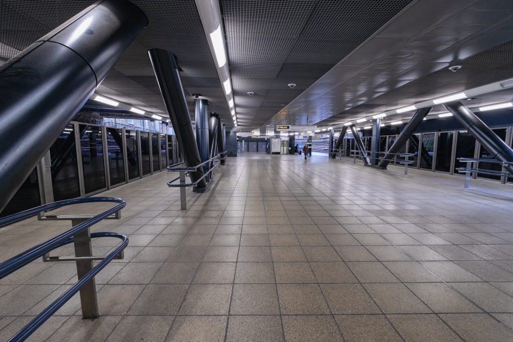
But, hidden underneath is one of the older platforms. The way the new has been incorporated into the old without overwhelming it or creating a feeling of oppression is really well done.

A woman wearing a red coaat and pushing a stroller walk along the Eastbound platform of the District Line of London's Undeground transit system at Whitechapel Station
The District Line platforms, newly covered by the remodelled ticket hall

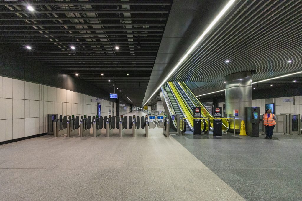
Dropping down to the platform, I continued my journey to my next waypoint, Farringdon. The texture of the arched ceiling above the escalator is repeated across the stations on the line. It gives a comforting sense of continuity but the stations become anonymous. Even as an infrequent visitor, I can identify some stations from the trains as I arrive at them and manage my journey accordingly. Information is provided by a large number of auditory and visual prompts but I can’t get away from the loss of individuality this represents.

Riding a well-lit escalator to the platform at Whitechapel.

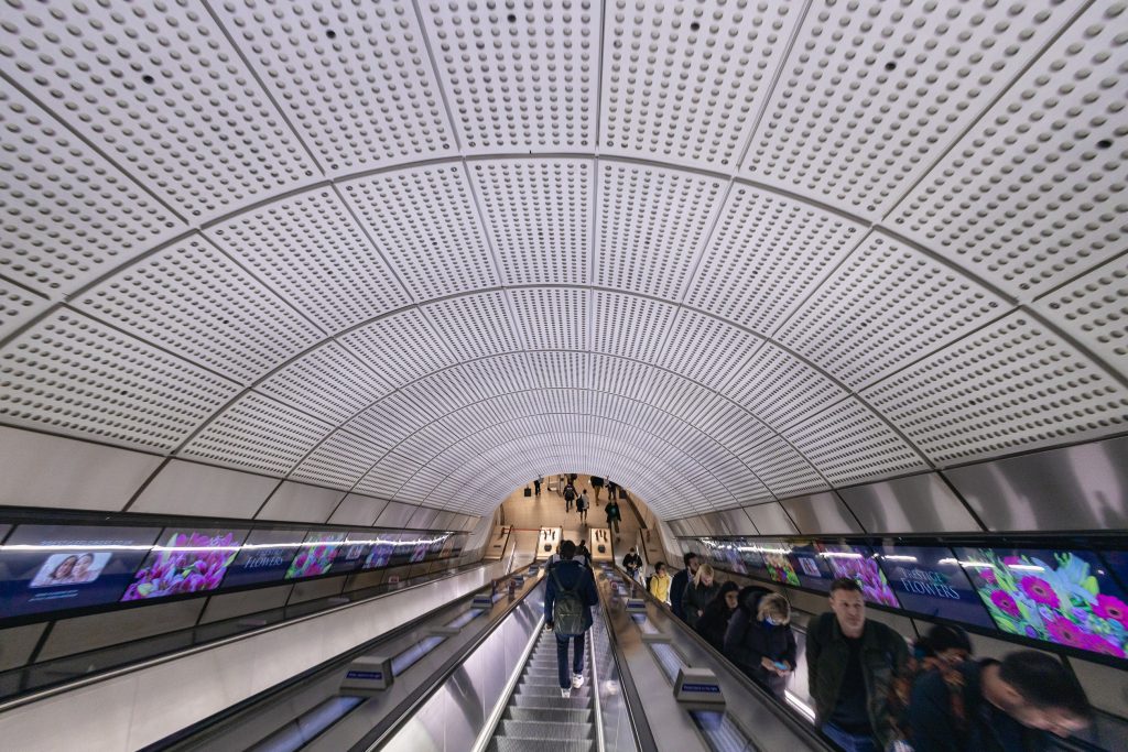
The uniformity of the stations does nothing to detract from their scale. The platforms are 210 metres long but this level of lighting and open design imparts a feeling of safety – as does the enclosure of the trains. Additionally, the detailing on the fixtures is a lovely thematic touch.

A low-level picture of the Farringdon Station, westbound platform showing the scale of the structure and highlighting the detail of the underground roundel on the seating

After a detour to the Barbican Estate for some brutalist architecture, I returned to Tottenham Court Road to transfer to the Northern Line via a series of escalators and corridors that managed the interface between the old and new parts of the station relatively well. Holding the theme from the Elizabeth Line as long as possible before moving from round to square, becoming liminal in the process.

A liminal corridor at the boundary between the new and old parts of Tottenham Court station.
Experiencing The Elizabeth Line, November 2022

This is What I Want

Or, “The Queue, Again”

Prompted by one of the topics covered in an episode of the “A Photographic Conversation” podcast, I had another think about my motivation(s) for going to London to take pictures on the final day of Queen Elizabeth II’s lying in state. I have already covered some of them in an earlier post but, even as I wrote it, I knew I was leaving a fundamental one out.

There is something in all those pictures that I want. Wether I’m reading something into the perceived emotional state of the subject(s) or the relationships they have with everything around them, there is something on display that I feel would benefit my emotional/intellectual state in some way. I have to articulate some of this in the captions.

I wonder if others see the same things, or if they see anything at all.

Have a look

This is What I Want

The Queue

Four letters following the important one lead me to London to take pictures.

As usual, though, it’s never about the first thing that comes to mind with me. I’m a republican with a small ‘r’, I like the thought of a monarchy based on a more European idea, something like the Dutch or Danish idea of a reduced familial footprint focussed on low-key ceremonial functions rather than full-on pomp and pageantry.

So why did I want to go and have a look?

It wasn’t to join, although I did walk to the start. When I heard the news of the death, I connected it to my mother’s death some years ago. The “stages” are there, they have been processed several times but still, a vestige of the grief remains and seeing the spectrum of responses from people – from angry swearing about the institution to tears about the death, let me think that I might use this as a proxy to see how my personal grief was resting.

Unsurprisingly, I was moved by the whole process. The instantaneous transfer of power on the day itself, through the steamroller of the constitutional process, to the volume of people proceeding in a stop/start way from Southwark Park to Westminster. I’m glad I was a small part of it. My own personal grief persists and it felt good to connect with people who looked like they were feeling everything I had felt over the years.

Coming together

So this iteration of the site is starting to take shape. The first time I used WordPress, I chose to host it on a service I selected for its price. On top of that, I bought a theme pack that did everything, including washing the dishes as far as I can tell. This combination brought the site to its knees very quickly and led to me trying Zenfolio for a year after I’d spent a lot of time trying to get the site to a state where it was reasonably responsive. Zenfolio was a significant improvement, easy to set up, maintain and update but expensive, as sales and commissions have been on the slow side, I decided to see what else might be on the market.

One of the things I used in my selection for hosting was to look at many recommendations from various photography sites. Oddly enough, I don’t remember them mentioning Amazon’s AWS or Google’s Compute platforms. Both of these have click-to-deploy WordPress setups which require filling in a few passwords and your hand is held pretty well.

This site is hosted on Google’s Compute platform at the moment. I’m using a simple theme with a couple of plugins to manage and display photographs and the performance seems pretty good. One of the things I like about WordPress is its modularity, so when I need to add sales or booking, it should be a relatively easy task.

Back to WordPress

Moving from Zenfolio to a compute instance of WordPress on Google has proved challenging but nothing I haven’t been able to handle and, to be honest, it’s been nice to get under the hood of a hosting solution.

Back from COVID

I seem to have lucked out with my first COVID infection. There will probably be more but this one wiped me out for a while. I’m slowly getting back into taking pictures so will update this more frequently from now on.

Amsterdam 2020

My last trip to Amsterdam was deliberately timed to be when the UK (or the majority of it) left the EU at the end of January 2020. Ever since I’ve been aware that we, as a country, were part of something bigger than ourselves, I have felt European and I still do, despite our current political status. As a member of Generation X, I’ve grown up without that feeling of a loss of empire or the sense of a martial victory over our closest neighbours that seem to afflict the generation prior to mine – the ‘boomers’. What has this got to do with this picture? I was there for four days and during that time, I discovered where three of the tracks went and only one of the roads. It was taken on my first night in the hotel, arriving earlier that evening. My sense of loss at the time had filled me with sadness and I felt as if the separation was permanent and total, leading to a more monochromatic view of the world. Looking back at it now, it is neither of those, things are only more difficult and challenging than they have been. I’ll be back!

Style and Vision

Understanding why I do what I do is important to me and I’ve been spending time trying to develop some further understanding of why I do it. So, this is part two of an earlier post where I started to examine the question.

I’ve mentioned that there is a torrent of information (pictures, reviews, tips, how-tos’ and never-ending lists) that I am aware of and try to remain abreast of which means I look at about 120 different articles a day. Today, I was looking through my collection of these (I use notion.so to collect and collate links) and picked out a video entitled “How To Find Your Style In Photography” by Pat Kay. This led me to another one of his, called “The REAL Secret To Get Better At Photography – Vision“. These two have helped me make a little more sense of how I currently work and what I’d like to achieve by talking about how these elements can be combined and how that leads to learning the language of visual storytelling. 

I was going to say that it’s like learning a new language but it really feels like learning how to talk again.